Click here for online Teacher's Guide.
The following maps are from the Library of Congress. The Library of Congress has thousands upon thousands of maps for public use that date from hundreds of years ago to present. Basically every branch of geography is represented in these maps, as well as cross-curricualr subjects like World and U.S. History.
 Click here for online map.
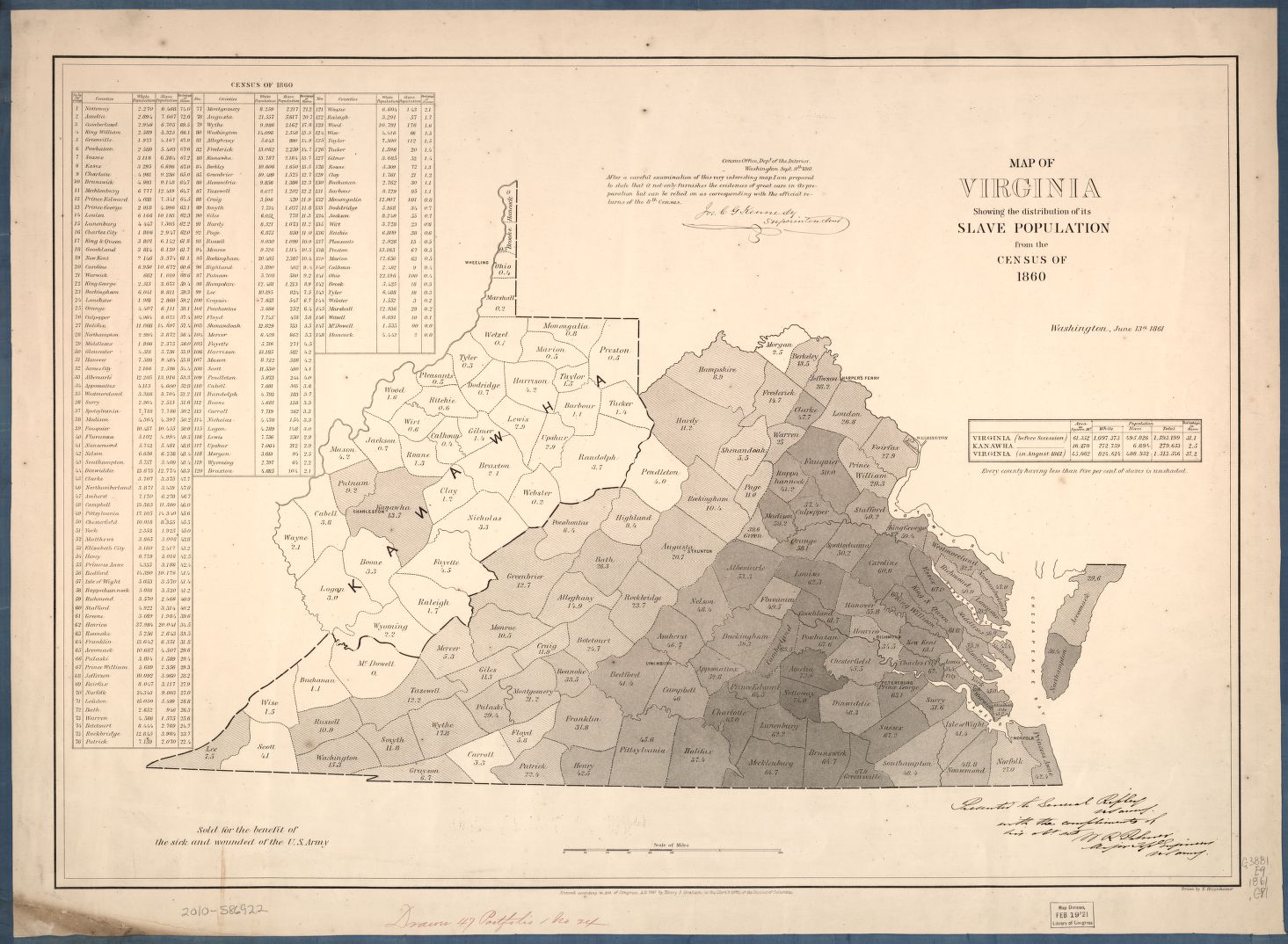
How would a student analyze this map? (Based off of Teacher's Guide above)
| Observe | Reflect | Question |
-I see the state of Virgina. I see the state divided into counties. The counties are different colors. The map is from 1860. It is a slave population map. There is an island and a place called 'Kanawha'. | -This map was made for a census. White males would have looked at this map. There are still state census maps today, but none about slaves. This map was made to understand slave population numbers in Virginia in the late 1800s. | -Did every southern state make maps like this? How did people count all of the slaves? Why is there a high concentration of slaves in the middle of Virginia? Why aren't there a lot of slaves in 'Kanawha'? |
 Click here for online map.
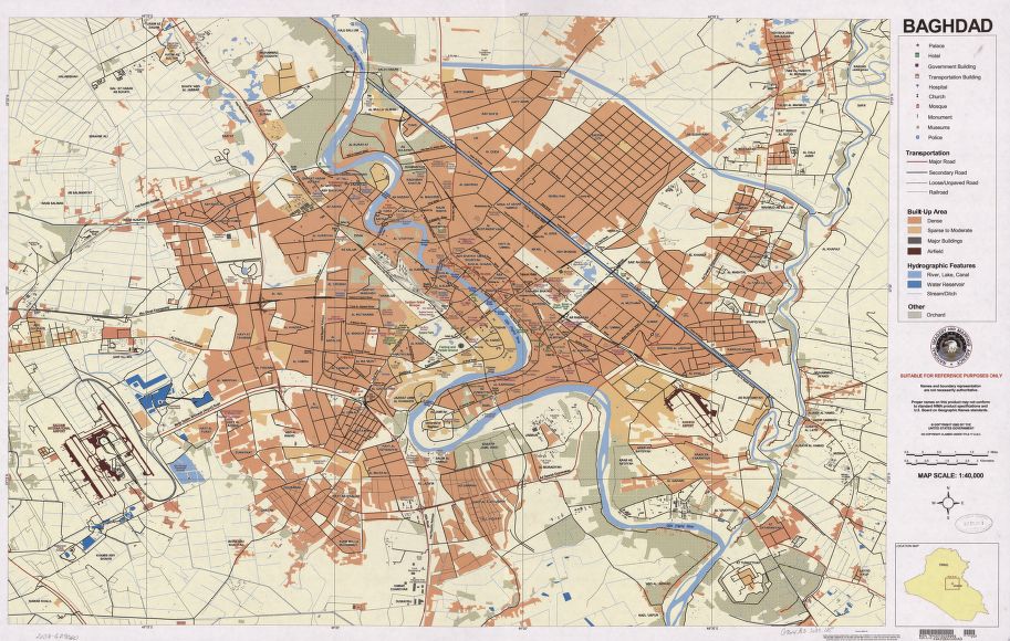
How would a student analyze this map?
| Observe | Reflect | Question |
| -I see a map of a city. There is a river that runs through the center. There is no city-layout pattern. There are different areas. Its a large city. There is an airport. | -This map was made due to public interest in the U.S. conflict in Bagdad/the Middle East. It is meant for a general audience. Current maps may look different due to the effects of war. | -Which areas were/are most affected by war? Where were U.S. troops located? In which areas do the most people live? How does the river affect daily life? |
 Click here for online map.
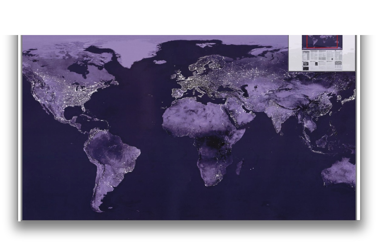
How would a student analyze this map?
| Observe | Reflect | Question |
| -I see a map of the world at night. The lights show where there are significant amount of electricty and people. Some areas of the world have hardly any light at all. Other areas are almost entirely lit, like Japan. There are more lights in the Northern Hemisphere. Certain geographic features can be seen based off of the light, such as islands and the Nile River. | -This map was made to show the world's populations. It was made from satellite pictures. It shows where people live and how socieites are located in relation to one another. | -Do people still live in areas without light, just without electricity? What are the reasons why people do not live in certain areas of the world? Why do more people live in the Northern Hemisphere than the Southern Hemisphere? |


